I’ve always believed that the tax office is kind of like Mordor where it doesn’t matter how shiny the day is outdoors, everything turns into a grey storm cloud once you cross the door.
I was never good at bureaucracy and I don’t know if I hate her or if she hates me even more… the thing is that these places intended for paperwork usually have the gift of making us feel even more clumsy and stupid than we are…
A few weeks ago, to my dismay, I had to go to the Agencia tributaria (the Spanish tax office) to get some certificates and what I found startled me…They had changed the interface of the turn taking machine and it couldn’t be worse.
I took pictures of the eyesore and of the steps you must take, as brain teasers, to get a ticket with the zone you must wait in and when it’s your turn…
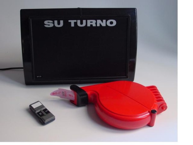
While I was using this machine I thought about those little devices in neighborhood stores and supermarkets to get a number and wait for your turn… A natural evolution of “Who’s last?”…Holy simplicity!
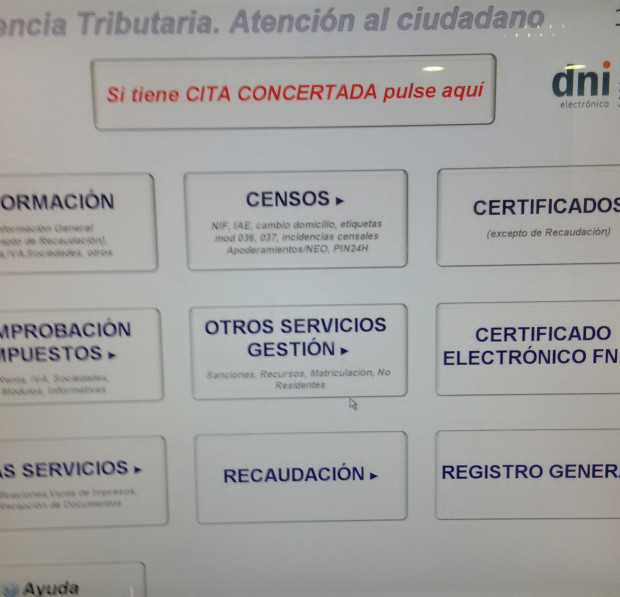
Here are the screens you must go through to get a ticket with your turn in Zaragoza’s Agencia Tributaria:
1. Select what you need to be assessed with.
Here begins the first cold sweat. As a normal citizen, you usually go to the tax authority office because you need to get a form or to do some paperwork, unknown until then for you. Once there, if you expect for something in the screen to give you some type of clue about what to select, you are so very wrong. Even more, normally, the person that is asking for a form/certificate/documents tells you: “you have to ask for it in the tax authority office… and take your turn in Census”. Once there you think: “Lucky me he/she told me where to go to get my turn…”.
Knowing what to choose in that screen mustn’t be easy when in the lower left side it offers help in case you don’t know what to choose… The reflection here should be: if you need to offer help, maybe it’s because you are not making it as simple as you should…
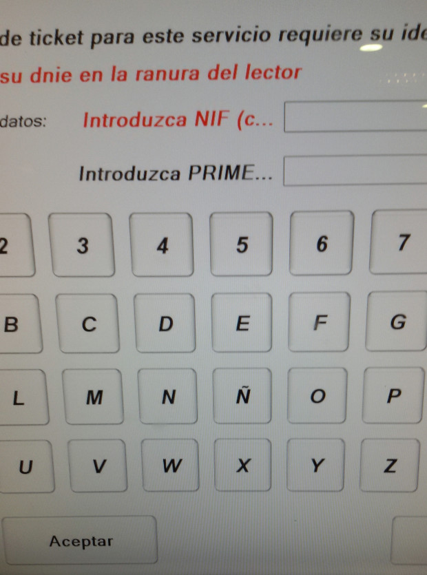
2. Identify yourself
Once you have chosen correctly where you must go (or that’s what you think), it asks you to identify yourself with your NIF (ID) and first surname. But, are you being serious? Why do you need to know who am I to give me a turn? This screen was unbelievable to me because it is not that there’s something specifically wrong but it’s ALL wrong.
- The fields you are asked to fill out can’t be completely read: you can only read “Introduce NIF (c…” and “Introduce FIRS…” to your understanding, they are asking you for your NIF and First surname (?)…
- When you start introducing the data in the fields, comes the following surprise, the keyboard is not in the QWERTY layout but the letters are ordered alphabetically which makes you have to look for each letter one by one instead of moving across the keyboard in an intuitive way…
- The confirm and cancel buttons are swapped: after overcoming the two previous tests, you hit the button on the right (because logic says the button on the right is to move forward and the button on the left is to move backwards) and the surprise is that after hitting the button on the right, you have cancelled and you must start from step 1 again…(¿¿¿$@@@¡¡&%%$$!!!)
Once the crisis is behind you, you repeat steps 1 and 2 and get to that same point, in which you must repeat mentally “Remember that Accept is on the left! Remember that Accept is on the left!”
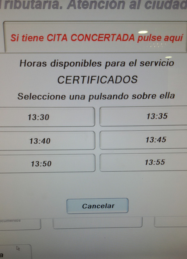
3. Select what time you would like to be assessed with
Eh? What time? NOW since I’m here! This is striking because it doesn’t seem like a logical question to a client typology like mine, the sporadic type. Maybe it makes more sense to professional offices with thousands of daily errands that come and go from different organizations…
Me (my user typology), if we go to the tax office it is to do paperwork in that moment and to leave as quickly as possible to work (or wherever)…
What it is asking us is: Do you want to be helped now or 25 minutes from now?”. If I’m already there, I obviously want the first available slot… I think they are mixing up two very different tools, the one to “Get a turn” and the other one to “schedule an appointment”. Both are very interesting but used in very different moments by users, and to mix them up ends up being confusing…
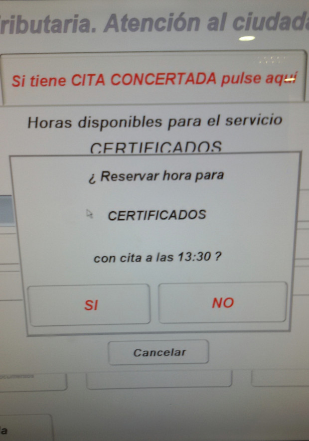
4. Confirm your appointment
Appointment for 13:30? And again, the “Yes” on the left and the “No” on the right… If you mess up now, you’ll get pissed off and go home.
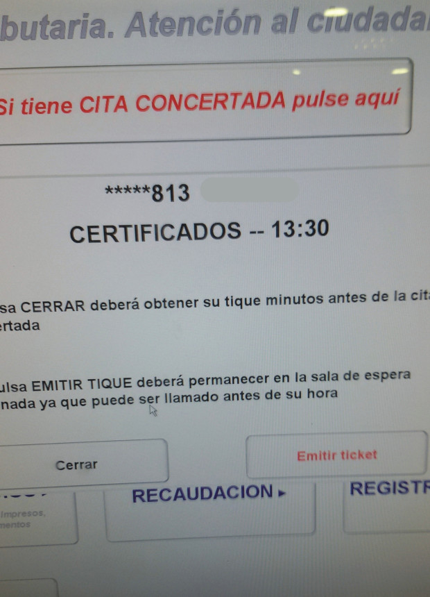
5. Confirm issuing of ticket
Confirm that you want to issue the appointment ticket… (“issue”, hmmm, what an interesting concept…) It is ok that it explains to you that if you accept issuing the ticket you must stay in the room, etc. but, of course I want to ISSUE the ticket!!!
Please, give it to me ONCE AND FOR ALL!!
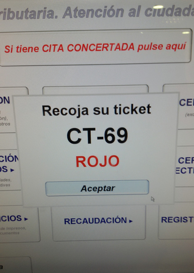
6. Accept ticket printing
Accept to ISSUE and then accept to PRINT… Of course I accept it, but give me my turn!
If we were talking about a tool made to give a turn for waiting, don’t you think that it could have jumped from the first screen to this one directly?
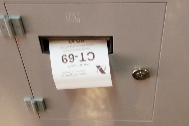
7. A ticket! A ticket!
I can’t believe it… I’ve made it!
This process is an absolute hell, consequence of which the line to be given a number at the counter is 3 times longer than the automatic machine ones. The application was changed not long ago and the proportion of people used to be the opposite, people preferred to get their numbers from the machine than from the counter, but now, for some people this process is simply such a big barrier that it’s insuperable.
In this process, my main difficulties were the selection of where I should go (screen 1) because it is complicated to know which internal department manages what type of paperwork or form; secondly, after introducing my NIF and Surname, I hit the “Cancel” button instead of accepting and I had to start all over again (the inverted buttons are hell!).
When I finished and noticed that behind me there was a 70-year-old lady, I knew that it would be impossible for that lady to get a turn with that machine. And I wasn’t the only one who thought that, because an IRS employee immediately approached to help her make it through…
This adventure with the IRS Take-a-Number machine reminded me of one of my favorite movies as a child, “The twelve tasks of Asterix”. One of the tasks he must get through is “Find Permit A 38” (A38 form) in “the house that drives you mad”, what he imagines to be simple since it is a mere administrative procedure ends up turning into a nightmare because he’ll have to go from window to window without moving forward…
Leaving comical similes and criticism (always constructive) aside, I also have to recognize the positive side, which is that the way the IRS personnel treated me was always beyond my expectations.
Finally and to conclude, my recommendation for the IRS and my request as a citizen would be if they could please redesign this user interface to focus it in the user typologies that are going to use it, and so it can achieve in the most simple way the purpose for what it is made: to give a ticket to reserve your turn.
There is a quote by Albert Einstein that every UX (User Experience) project should follow:
“Everything should be made as simple as possible, but not simpler“
Albert Einstein
